|
|
Post by TruelyMostWanted on Jul 12, 2018 14:23:16 GMT -5
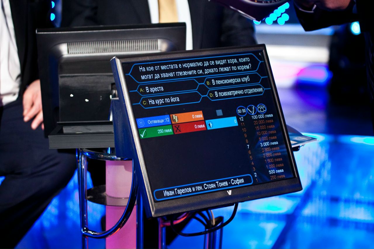
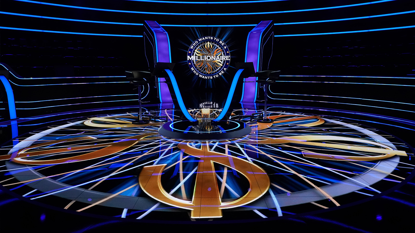
Hey guys. I already did this in my community discord. Now i wanna know it from the forum. Below you find 37 different Studios <(NR) - COUNTRY - "TITLE"> I would like to know from you guys a) Which one do you like the most, b) What are your Top 5 studios c) Which one do you think is the ugliest one. Feel free to explain why you like it or what especially you like. Also for those who design their own hybrid studio, feel free to get some inspiration here IF you want to ADD A STUDIO which isnt in this List already, please write above the (NEXT NR) - COUNTRY and "TITLE/YEAR" like i did. Enjoy discussing and Voting. *ASK THE AUDIENCE PLAYS" On your Keypads Audience... If you are ready... Vote Now! (1) - Germany (Studio in the Netherlands) - First Episode 1999  (2) Germany - 2004  (3) Germany - 2014 "15 Years WWTBAM" (Studio Design until today)  (4) Austria (German Studio) - 2018  (5) Czechia (German Studio) - 2016/2017  (6) Switzerland (German Studio) - 2009?  (7) Belgium "Hot Seat" - 2015  (8) UK - 1998  (9) UK -2004  (10) UK - 2008  ![]() (11) UK - 2014  (12) UK "20th Anniversary" - 2018  (13) France - 2013  (14) France - 2014-2016  (15) US - 1999  (16) US - Syndication 2004  (17) US Clock "10th Anniversary" - 2009  (18) US "Millionaire is Back" - Shuffle1 - 2010  (19) US - Shuffle2  (20) US - Season 16 - Las Vegas  (21) Poland - Millionerzy 2006  (22) Poland - Millionerzy 2017-today  (23) Australia - First Ever Hot Seat Episode - 2009  (24) Australia - Hot Seat since 2014?  (25) Finland - Haluatko Miljonääriksi - 2018  (26) - Norwegian - Postkod Miljonären - 2018  (27) Indian / Kannada - 2018  (28) Kazakstan - 2017/2018  (29) Brazil - Quem Quer Ser Um Milionario (2018)  (30) Ungary - Leygen ön is Milliomos (2009)(bearbeitet)  (31) Russia - since 2014? until today  (32) Vietnam - 2009  (33) Bulgary - Stani Bogat - 2018  (34) Hong Kong - 2018  (35) Turkey - 2018  (36) Netherlands - "Lotto Weekjend Miljonairs" - 2009  (37) Netherlands - "Lotto Weekjend Miljonairs" - 2011  |
|
|
|
Post by millionairenut on Jul 12, 2018 21:50:23 GMT -5
Well, nostalgia kicking in says that U.K. 1998 and U.S. 1999 are my favorites, though objectively speaking, I'm not sure. Truth be told, I love Millionaire so much that no studio is truly ugly, though I obviously prefer some more than others.
If I had to rank my top five, in no particular order, this is what it would like.
#1 Belgium Hot Seat - I am not a fan of the hot seat format. However, look at all of these studios in these pictures and notice the coloring of the studio of this one. It's a nice shade of gold. When looking upon all these pictures, this one stood out the most to me and it was the one I gravitated toward.
#2 Russia's present studio - Again, this looks really, really nice with the coloring of the studio, and it stands out. However, I am really taken aback by just how small it looks. This looks even smaller than Nigeria's studio. By contrast, Poland's looks awfully large.
#3 Austria (German Studio) - I was very impressed by this studio when I saw Hooman Vojdani scoop up the top prize. I especially like the green lighting as I think it adds its own sense of uniqueness. As trivial as this sounds, the rails on the staircases really stick out as well. Not to mention I really like the logo.
#4 U.S. 1999 - Okay. I just had to give in. This is the studio I know, the studio I love. Some of these have appealing designs in one way or another. I think the U.K. 2018 set is very dark, but I really like the center floor design. I like the flames for the current Australian hot seat set, but not so much anything else. Maybe I'm letting nostalgia cloud my judgement, but this is just a classic.
#5 U.K. 2004 - 1998 just looks smaller, and I knew I would have to put a U.K. studio on here, too. Millionaire made a number of improvements in its home country over the years, and I think the studio was one of them. Of course, when it all began in 1998, they did some things that we don't know now. For example, they started off with a basic question for the fastest finger rather than put something in order. For a while, Australia did this format. I know they did this until at least 2000, maybe longer, though the U.K. switched over to putting things in order. Not to mention, if you go back and watch the 1998 episodes, there was no final answer. Answers would be locked in. The U.K. clearly evolved to what we know and love now, and I have to say that even though I hold the 1998 studio close to my heart, it just looks different because the crowds just really look packed in to me.
If I had to say which studios I don't really care for, the U.K. studios after 2004 and the French studios you mentioned I'm not overly crazy about. Like I said, Millionaire is such a beautiful game that no studio can be truly ugly, but I'm not a fan of the aforementioned.
|
|
|
|
Post by thejinkazama on Jul 26, 2018 10:21:06 GMT -5
Thanks for sharing these, it's really interesting to see the various studios compared to one another. I think the Russian version looks a bit basic, at least going by the photo you uploaded. The Belgium version is certainly a bit different - why are the FFF contestants so close to the centre?
|
|
|
|
Post by crazyhu on Aug 25, 2018 16:10:32 GMT -5
Thanks for sharing these, it's really interesting to see the various studios compared to one another. I think the Russian version looks a bit basic, at least going by the photo you uploaded. The Belgium version is certainly a bit different - why are the FFF contestants so close to the centre? Australian Hot seat is the same way too, I guess they can take the podiums out when they are done |
|
|
|
Post by bossingvicfan on Aug 31, 2018 21:58:07 GMT -5
I'm surprised that the Philippine set is not there.
|
|
DoreK
Fan Games Pass Holder 
Posts: 87 
|
Post by DoreK on Sept 8, 2018 15:30:42 GMT -5
Polish WWTBAM is started in 2008, it was not in 2006, can you change it?
|
|
|
|
Post by murtican on Sept 9, 2018 5:43:49 GMT -5
And my country Turkey version studio - 2018 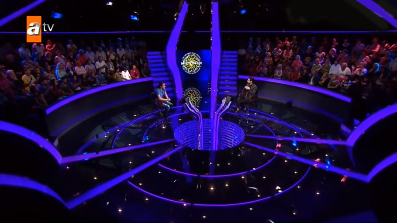 |
|
DoreK
Fan Games Pass Holder 
Posts: 87 
|
Post by DoreK on Sept 9, 2018 17:04:07 GMT -5
It is a pity that the Bulgarian set design is an unsuccessful copy of the Polish set design.
I have reservations about the amount of lights. There are so many of them that you can hardly see anything.
The LED strips behind the audience are very strange.
LED strips under the glass floor look quite comic, probably because they are unevenly distributed.
I also like the Finnish set design. It is small, but made very nice.
The only defect (in my opinion) is actually that the audience is a little underexposed there.
I also have a similar opinion about the Turkish version - the scenography is very similar to what we had the opportunity to see in UK until 2014, but in a slightly smaller version.
|
|
|
|
Post by marik on Sept 9, 2018 18:15:27 GMT -5
|
|
|
|
Post by wwtbamukfan on Sept 10, 2018 11:15:46 GMT -5
I really like the Bulgarian and Polish ones, and I don't like the current US one because the big screen is too wide.
|
|
DoreK
Fan Games Pass Holder 
Posts: 87 
|
Post by DoreK on Sept 11, 2018 15:55:59 GMT -5
I also have such a sentence when it comes to the US - there everything properly deviates from the format
|
|
Deleted
Deleted Member
Posts: 0
|
Post by Deleted on Sept 23, 2018 14:23:06 GMT -5
|
|
HuyDarwin
 Hello! I am HuyDarwin, and my account here used to have a name which is Pinkhuy.
Posts: 17
|
Post by HuyDarwin on May 30, 2020 3:54:36 GMT -5
That Vietnam studio is 2018-present one, not 2009. Can you edit it please?
|
|
|
|
Post by TruelyMostWanted on Aug 4, 2020 7:28:44 GMT -5
Even though my own thread here is dead for a long time, i think its time to bring the topic back up. Why?As you probably have noticed, few countries around the globe are adapting the UK studio and the Olga van den brandt graphics. As a result of that there is less a comparison possible thesedays. If everyone adapts the current UK 20th Anniversary styled studio, then "no matter where, it looks exactly the same as this one" - Chris Tarrant becomes true. And this results in there is less or even no need for a "International Studio Comparison". Less countries with individual changes, styles and individualities. Out of my head, from the current running versions... there are just 13 different sets still up in their own personalized classic style. Germany & Austria (count as 1 , since its produced in the same studio) Netherlands France Denmark Sweden Poland Russia India Vietnam Australia Brazil Argentina Croatia (sorry if i'm missing anybody on the list) Now about the other side of this post. Who is using the exact same UK 20th Anniversary Studio? So far we have 6 countries now in total who use the set 1:1 as well as 1 country who mixed UK with France.(Chile) (1) United Kingdom (2) USA (2) USA
(3) Portugal (red circle on the videofloor = HotSeat Clock) (4) Isreal (Clock format for Q1-5 on both entrance & videofloor) (4) Isreal (Clock format for Q1-5 on both entrance & videofloor)  (5) Spain (COMING SOON) (5) Spain (COMING SOON)
  (6) Turkey (COMING SOON) [set building = work in progress] (6) Turkey (COMING SOON) [set building = work in progress] (7) Chile (rebuild of UK 20th Anniversary + some elements from France) (7) Chile (rebuild of UK 20th Anniversary + some elements from France)
 with that beeing posted... Who will be next to join the "Who Wants To build their own version of the UK set?" list? i smell a new standard for the next decade or so But this my friends is actually still a studio comparison, they are so much the same, and also so different in terms of small individualities |
|
|
|
Post by esn on Aug 4, 2020 9:18:29 GMT -5
I like new British design, so I am excited that more countries starts to use it. But I hope some countries in the future will return stairs to the old places. Chile did it but their studio looks different because of French design parts
|
|


![]()


 ) I guess the next on will be Poland then...


 2008 - 2014

